- July 5, 2024
- Posted by: Sudharchanan Vinayagam
- Categories: AI/ML, Data Analytics, Data Visualization, Python library, Streamlit
Introduction
Heart disease is a prevalent health condition that affects millions of individuals worldwide. Early detection and intervention are crucial for managing this condition effectively. In this blog post, we explore the use of data analysis and machine learning techniques for heart disease detection. Leveraging a dataset from Kaggle, we analyze key attributes related to heart health and develop predictive models to identify individuals at risk. Through interactive visualizations and model evaluation, we aim to provide insights into the factors contributing to heart disease and offer a means of predicting individual risk levels.
Data Source
The dataset used for heart disease detection was sourced from Kaggle. It includes the following attributes:
- Age: Ranges from 0 to 80 years old.
- Gender: Male or Female.
- Chest Pain Type: Typical Angina, Atypical Angina, Non-cardiac, Stable Angina.
- Resting BP: Resting blood pressure.
- Cholesterol: Serum cholesterol in mg/dl.
- Fasting Blood Sugar: Fasting blood sugar levels > 120 mg/dl.
- Resting ECG: Resting Electrocardiographic Results (ECG) – Values 0, 1, or 2.
- Max Heart Rate: Maximum heart rate achieved.
- Exercise Angina: Presence of angina caused by exercise.
- Oldpeak: ST depression induced by exercise relative to rest.
- Slope of Peak Exercise ST Segment.
Cardio Analysis for Heart Disease Detection:
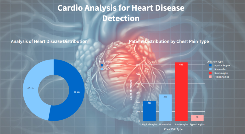
We conducted an in-depth analysis of heart disease using interactive visualizations created with Plotly. Key performance indicators included:
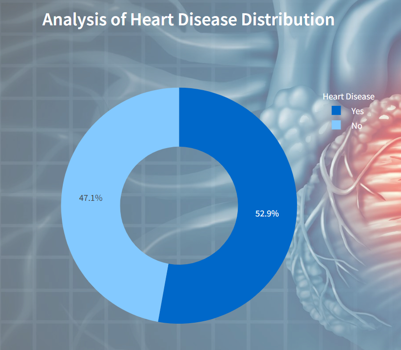
Analysis of Heart Disease Distribution
The plotly visualization displays distribution of heart disease presents a pie chart depicting the distribution of individuals based on the presence or absence of heart disease.
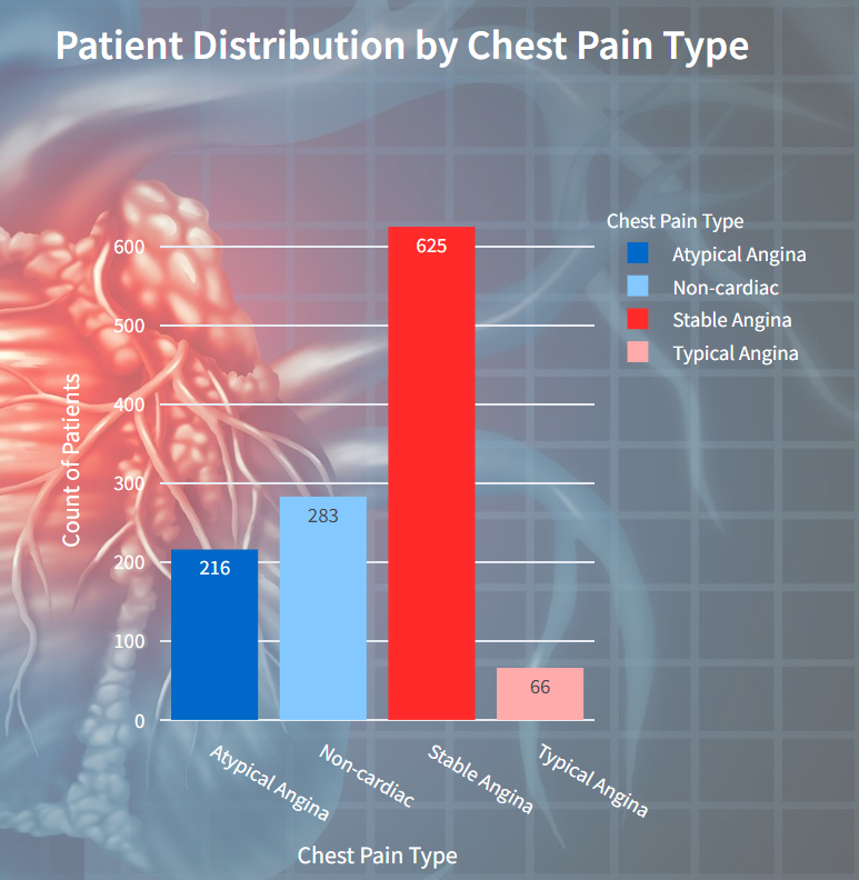
Patient Distribution by Chest Pain Type
In this visualization displays the distribution of patients based on different types of chest pain they experienced. Each bar represents a chest pain type, with the height indicating the count of patients.
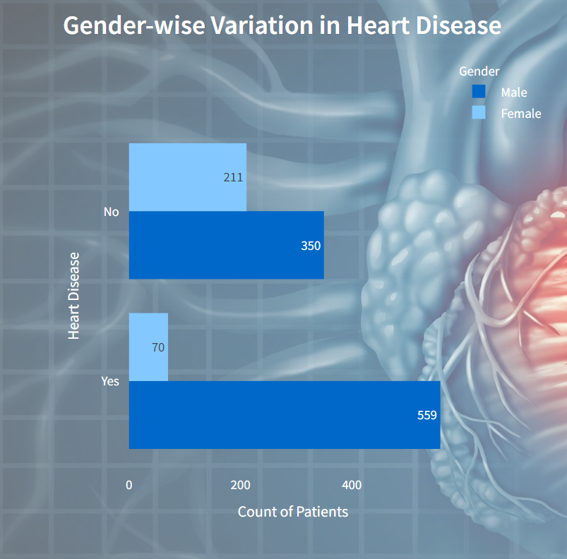
Gender-wise Variation in Heart Disease
In this visualization presents a comparison of heart disease occurrence between genders. It showcases the distribution of different types of heart disease among males and females.
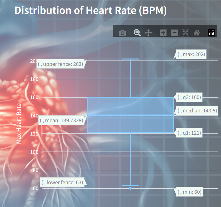
Distribution of Heart Rate (BPM)
It visualizes the spread and central tendency of maximum heart rates (BPM) recorded across a dataset. The box plot showcases the quartiles, median, and any potential outliers in the heart rate data.
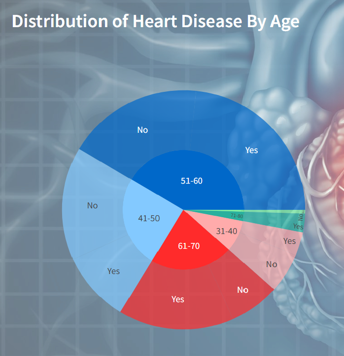
Distribution of Heart Disease by Age
It visualizes the distribution of heart disease cases across different age groups. Each segment in the sunburst chart represents an age group, with sub-segments indicating the presence or absence of heart disease within each age group.
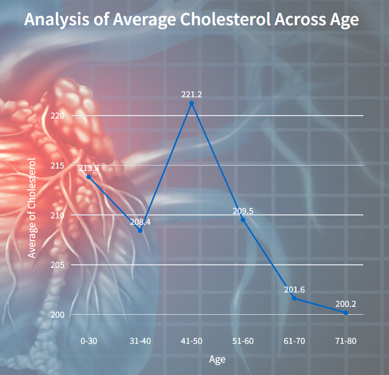
Average Cholesterol Across Age
This visualizes the relationship between age and the average cholesterol level. Each point on the line represents the average cholesterol level for a specific age group.
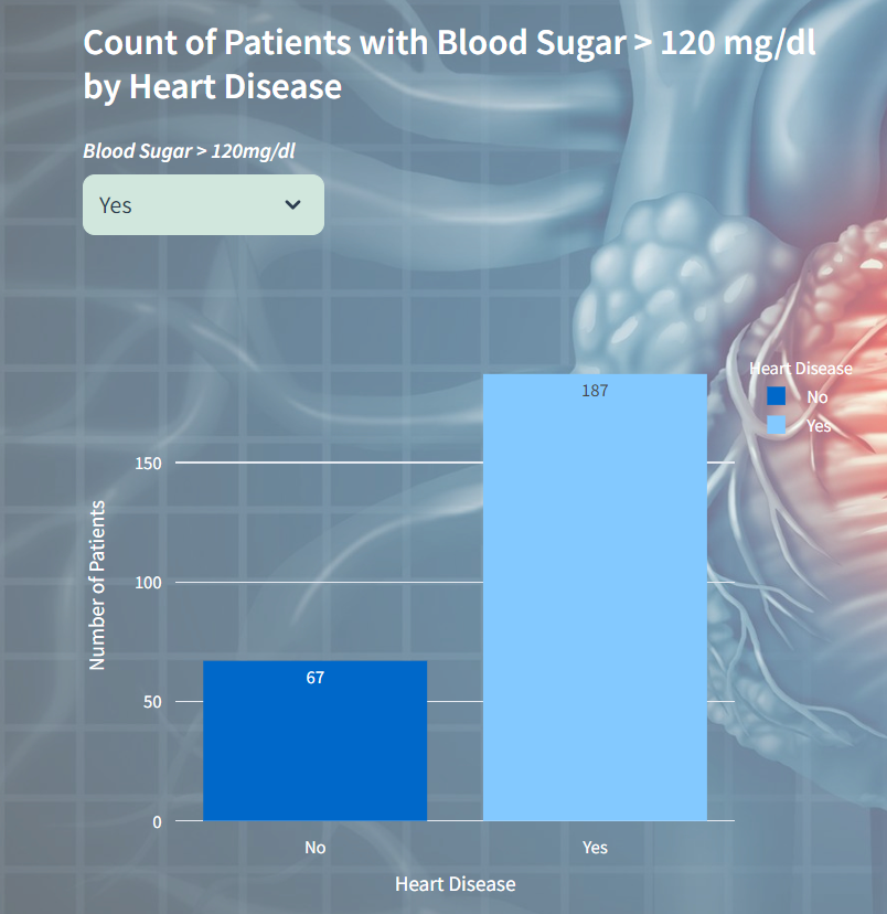
Count of Blood Sugar Variations
In this visualization displays the count of patients with blood sugar levels greater than 120 mg/dl categorized by their heart disease status. It allows users to select between Yes and No options for blood sugar levels, and then presents a bar chart showing the corresponding counts of patients with and without heart disease.
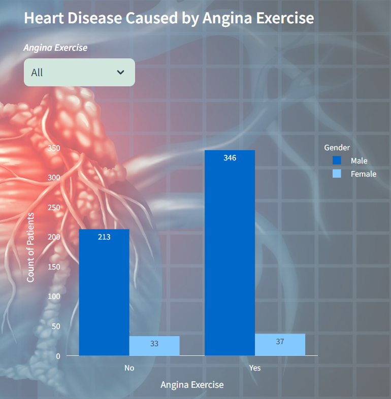
Count of Heart Disease caused by Angina Exercise
In this visualization displays the distribution of heart disease cases resulting from angina exercise, segmented by gender. Users can select between All, Yes and No options for angina exercise. The chart showcases the count of patients, with male and female cases represented by distinct colors.
Cardio Prediction for Heart Disease Detection:
For heart disease prediction, we employed decision tree, random forest, and gradient boosting classifiers to evaluate data accuracy and select the best model. Users can upload a custom unknown dataset in CSV format to make predictions for heart disease detection. Additionally, visualization of feature importance highlights the contributions of features in the models.
Steps to Build Prediction Model:
Step-1: Importing Packages
First, necessary libraries such as streamlit, pandas, and scikit-learn are imported. Additionally, Plotly Express is imported for data visualization.
Step-2: Loading Raw Data
Next, the raw data is loaded from a CSV file named heart_dis.csv into a pandas DataFrame(rawData).
# load raw data
rawData = pd.read_csv('Heart_dis_detect\dataset\heart_dis.csv')
rawDf = pd.DataFrame(rawData)
Step-3: Feature Engineering
Here, one-hot encoding is applied to the Resting BPs column from copy of rawData dataset (fe_rawData). The resulting encoded features are stored in a new dataframe (encoded_df) with column names generated as RBP_Normal, RBP_Elevated, RBP_Stage-1_Hypertension, RBP_Stage-2_Hypertension, RBP_Hypertensive_Crisis. Finally, the encoded dataframe is concatenated with the original dataset to create a new dataframe (fe_df) with the additional encoded features.
# One-Hot-Encoding for Resting blood pressure
encoder = OneHotEncoder(categories='auto')
encoded_data = encoder.fit_transform(fe_rawDf[['Resting BPs']])

# Define meaningful names for the one-hot encoded features
rbp_categories = ['Normal', 'Elevated', 'Stage-1 Hypertension', 'Stage-2 Hypertension', 'Hypertensive Crisis']
column_names = [f'RBP_{category.replace(" ", "_")}' for category in rbp_categories]

# Create a new dataframe with one-hot encoded features
encoded_df = pd.DataFrame(encoded_data.toarray(), columns=column_names)

# Concatenate the encoded dataframe with the original dataframe
fe_df = pd.concat([fe_rawDf, encoded_df], axis=1)
Step-4: Preparation of Data
Next, the raw data is loaded from a CSV file into a DataFrame (rawData). The DataFrame of training data is split into features (X_features) and target (Y_target) variables.
# create features and target variables
rawData = pd.read_csv('Heart_dis_detect\dataset\heart_dis.csv')
rawDf = pd.DataFrame(rawData)
X_features = rawDf.drop(columns=['Heart Disease'])
Y_target = rawDf['Heart Disease']
Step-5: Splitting Data for Model Training
The raw data is further divided into training and testing sets using the train_test_split function from scikit-learn. It divides the features (X_features) and target variable (Y_target) into training and testing data, with a specified test size of 20% and a random state for reproducibility.
# splitting training data
x_train, x_test, y_train, y_test = train_test_split(X_features, Y_target, test_size=0.2, random_state=0)
Step-6: Model Selection
Then, the user selects a machine learning model (Decision Trees Classifier, Random Forest Classifier, or Gradient Boosting Classifier) through a dropdown menu.
Based on the selected model, a pipeline is created to standardize the features and train the selected classifier.
filter_option = ('Decision Trees Classifier', 'Random Forest Classifier', 'Gradient Boosting Classifier')
col1, col2 = st.columns([0.2, 0.8])
with col1:
mod_sel = st.selectbox("***Model Selection***", filter_option)

# Standardization for feature scaling
if mod_sel == 'Decision Trees Classifier':
   pipe = Pipeline([("std_scalar", StandardScaler()), ("Decision_tree", DecisionTreeClassifier())])
elif mod_sel == 'Random Forest Classifier':
   pipe = Pipeline([("std_scalar", StandardScaler()), ("randomForest_tree", RandomForestClassifier())])
elif mod_sel == 'Gradient Boosting Classifier':
   pipe = Pipeline([("std_scalar", StandardScaler()), ("gradient_boosting", GradientBoostingClassifier())])
Step-7: Fitting and Predicting on Training Data
The model is fitted to the training data, and predictions are made on the testing data.
# model fitting
pipe.fit(x_train, y_train)

# Training model prediction
pred = pipe.predict(x_test)
Step-8: Evaluation Of Model
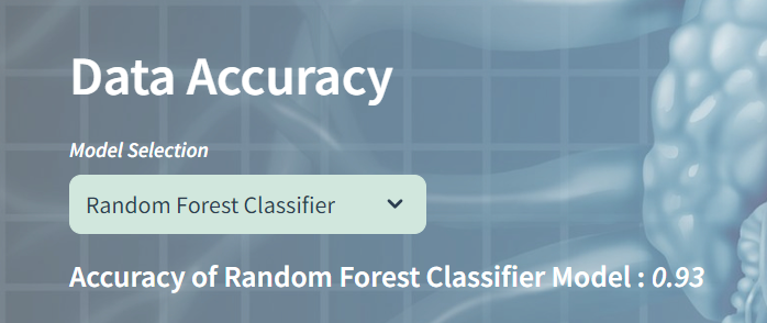
The accuracy of the model is computed using the accuracy_score function from scikit-learn and displayed to the user.
# evaluating model performance using accuracy_score metric
mod_acc = accuracy_score(y_test, pred)
st.markdown(f"<h5 style='color: white;'><b>Accuracy of {mod_sel} Model :</b> <i>{mod_acc:.2f}</i></h5>", unsafe_allow_html=True)
The model’s accuracy will be evaluated based on the chosen model. Here’s an example of the accuracy results if you select the Random Forest Classifier.
Step-9: Upload Dataset for Prediction
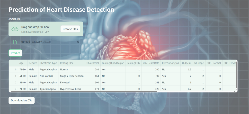
Afterwards, the user can upload a custom dataset for prediction. A file uploader widget is displayed with the label Import file. Users can upload CSV files using this widget. If a file is uploaded, its contents are read into a Pandas DataFrame named upd_data for further processing.
# handling uploaded custom data
uploaded_file = st.file_uploader("***Import file***", type=["csv"])
if uploaded_file is not None:
    upd_data = pd.read_csv(uploaded_file)
Step-10: Predicting with Uploaded Data and Download the Outcome
Predictions are made using a machine learning model (pipe) on new data (upd_data). The predictions are stored in a list named cust_pred_list. Then, in a loop, the predicted values are appended to the list, and any unnecessary values at the end are removed.
cust_pred = pipe.predict(upd_data)
cust_pred_list = list(cust_pred)

for index in range(len(X_test)):
    # insert predicted values to list
    cust_pred_list.append(cust_pred)
    # remove unneccessary value at last
    cust_pred_list.pop()

# Update Prediction Result
upd_data['Heart Disease'] = cust_pred_list
The dataframe final_df using Streamlit’s st.dataframe function, presenting the predicted outcome of the analysis.
# Return Predicted Outcome
st.dataframe(final_df)
The convert_df function is designed to convert a DataFrame into a CSV format and encode it into UTF-8. It then generates a download button using Streamlit’s st.download_button function to allow users to download the CSV file with the predicted data.
# download predicted resultant data
def convert_df(df):
    return df.to_csv().encode('utf-8')
    csv = convert_df(final_df)
    st.download_button(
	label="Download as CSV",
        	data=csv,
        	file_name='predicted_data.csv',
        	mime='text/csv'
    )
Step-11: Exploring Feature Importance
Finally, the Feature Importance of the selected model is calculated, and a bar chart visualization is generated using Plotly Express to display the importance scores of each feature.
# feature selection
if mod_sel == 'Decision Trees Classifier':
    # Access the model from the pipeline
    model = pipe.named_steps['Decision_tree']
elif mod_sel == 'Random Forest Classifier':
    model = pipe.named_steps['randomForest_tree']
elif mod_sel == 'Gradient Boosting Classifier':
    model = pipe.named_steps['gradient_boosting']

# Get feature importance
feature_importance = model.feature_importances_
feat_imp = [(feature_importance[i], final_df.columns[i]) for i in range(len(feature_importance))]
df_fi = pd.DataFrame(feat_imp, columns=['Score', 'Columns'])
df_fi.sort_values(by='Score', inplace=True, ascending=False)
df_fi = round(df_fi,2)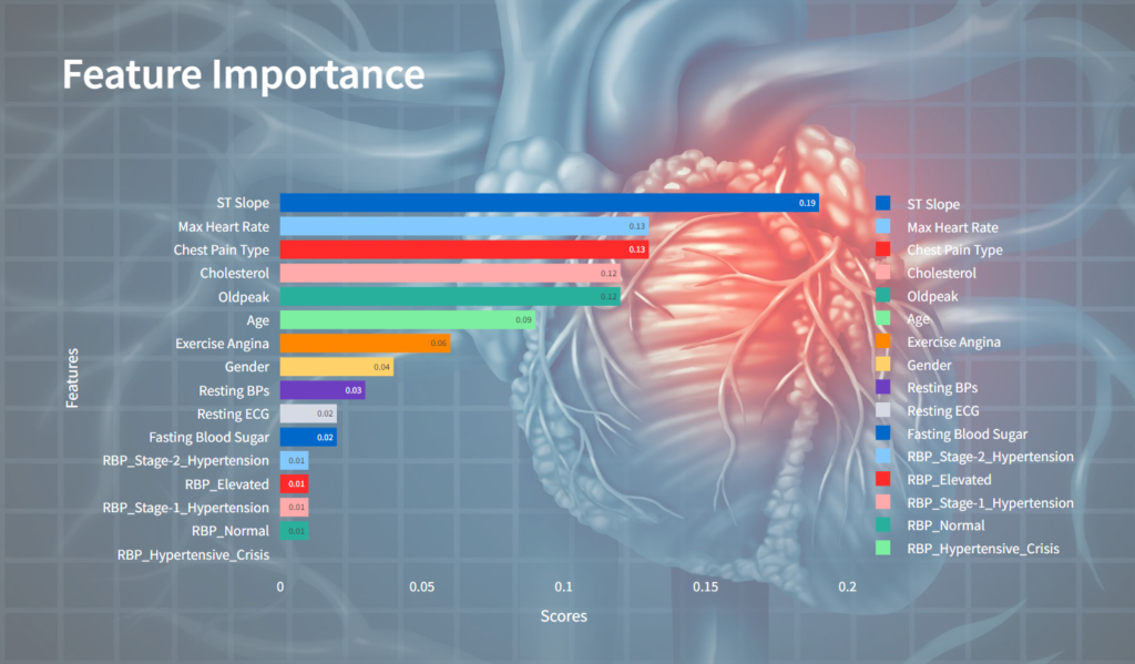
This provides a user-friendly interface for heart disease detection and prediction, with interactive visualizations and model evaluation.
Conclusion
The analysis and prediction of heart disease using machine learning models provide valuable insights for early detection and intervention. Interactive visualizations aid in understanding key factors contributing to heart disease, while predictive models offer a means of assessing individual risk. Continued research and development in this area hold promise for improving cardiovascular health outcomes.
Explore Further
For more in-depth exploration of our insights, visualizations, and predictions, please visit our website at Heart Disease Detection.
Please feel free to get in touch with us regarding your Streamlit solution needs. Our Streamlit solutions encompass a range of services and tools designed to streamline your data visualization, quick prototyping, and dashboard development processes.

