- May 27, 2019
- Posted by: Siva Mani
- Category: Power BI
Power BI is recognized for its elegant visualization capabilities. However, you might require a specific feature/option that you might have experienced in some other BI tool. Here is an option that we have discovered recently – Dual Y axis in Area/Line chart.
This blog helps in representing your data in a dual axis Area/Line chart.
Step 1: Import Power KPI visual in your Power BI desktop
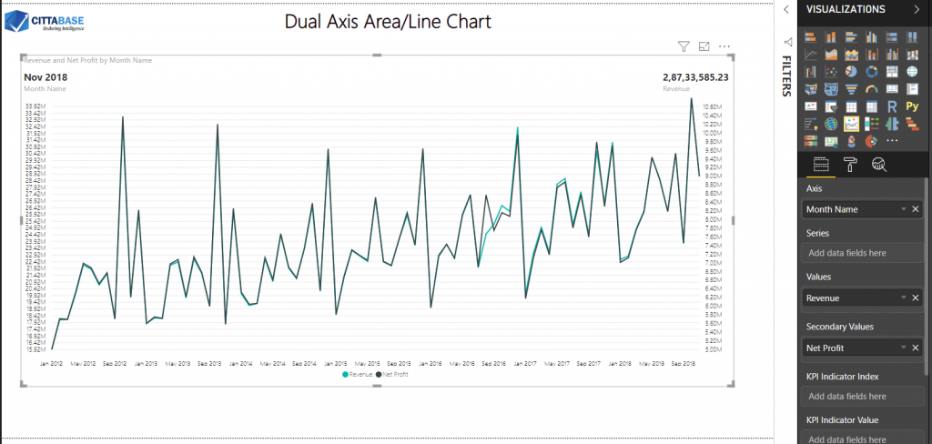
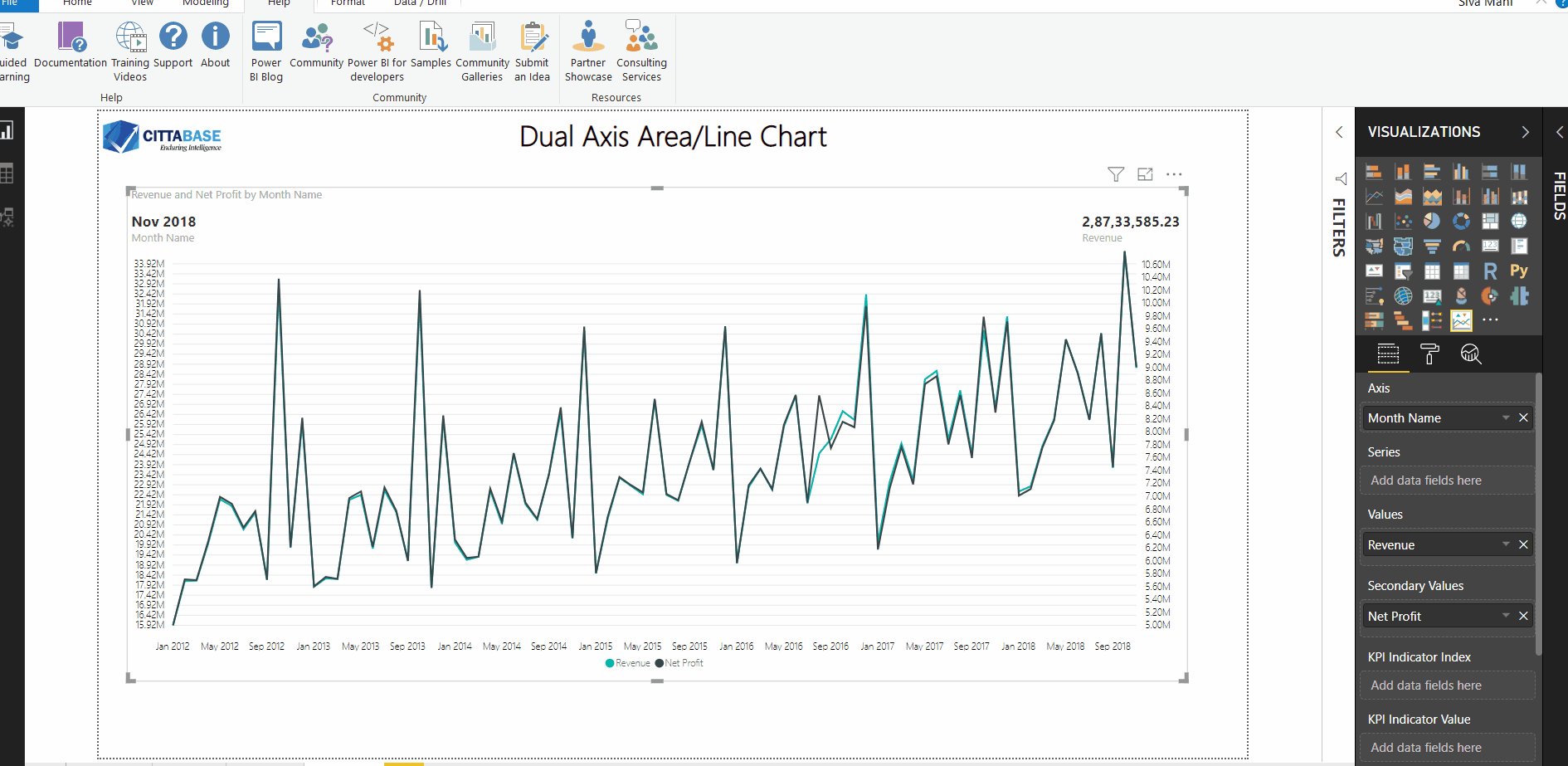
Step 2: Add Power KPI visual in canvas & add necessary fields in the visual
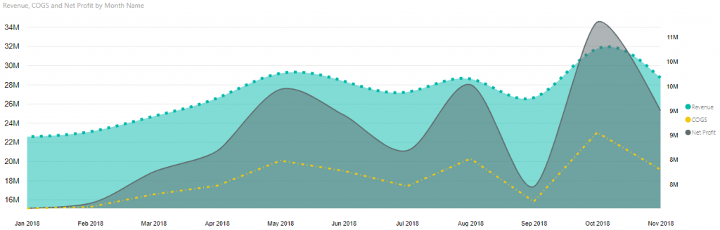
In this example, I included Month in X-axis, Revenue measure in Y-axis and Net Profit measure in Secondary Axis
Steps 3: Formatting
I did the following formatting in the visual,
- Turned off the KPI indicator and its relevant options
- Axis label formatting
- Line style change
Similarly, you can do the following formatting,
- Dual axis Area chart
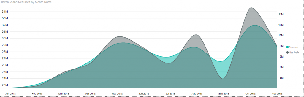
- Line and Area combination

- Differentiate each series
With the above steps, you can create a Line/Area chart with two Y-axis. Please feel free to reach Cittabase for more information. Visit our blogs for more topics on Power BI.
2 Comments
Comments are closed.
Please could you send me the pbix file for the reference.
@venu_sura:disqus , Unfortunately, I couldn’t. Please do follow the steps specified in the blog and feel free to post your queries here.